Title Image

IDEA EXCHANGE

Join the Conversation

What Not To Do On Your Website

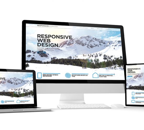
Welcome to your website. You’ve taken a look at it recently, right? Well, you should. You scrutinized it when you were first putting it together, hanging over every word, every photo, and agonizing over space and color options. But that was then. Maybe that was two or three years ago… and things have changed.


Two or three years is about it for a website look. They tend to look peaked and tired after that amount of time. So get in there, look around, and freshen that website up!


A good place to begin? Your landing page. It’s your introduction to visitors and potential customers. It’s the firm handshake that gives the first impression.


Here’s what you don’t want to do: hit them with too much information. Or intimidate them with a learning curve about your business. Or give them too many choices. Or use a lot of industry terms. Each of those things can be intimidating, or potentially turn a customer off, or confuse them, so they’ll end up doing nothing.


Nope. Your landing page is going to be fresh and welcoming with a general introduction, short and sweet, just enough to inform and tease your visitors. Save the drill down for specialized interior landing pages where visitors can learn more if they are interested.


As for the navigation, well, your mom should be able to easily scroll through it. How many drop-downs and sub-navigation buttons do you have? While you may think it is helpful for people to go directly to pages with deeper info, seeing all this at once can cause instant confusion. Or overload. Or create indecision. And that mean visitor shut-down.


If you are guilty of any of these sins, then by all means, fix them.

You aren’t doing a complete website revision. You are freshening your site up. Just top off the tank, reworking trouble spots.


Ask others to weigh in from inside your business and outside. Listen to what they say.


Now, let’s look at your photos

Please tell us you aren’t using shlock stock. You know, those cheesy stock photos that are filled with pensive people at their desks in casual attire, studying their laptops. Or high-fiving the team. Ugh. Stock photographs are easy to spot. Ditch them. They make you look ingenuous, uncreative, and the worst – like everybody else.


It’s easy enough to hire a photographer and take real photos. Of your people. Working in your actual headquarters. Real photos can even be taken by someone on staff that knows her way around photography. You don’t have to be a professional photographer to get website-quality photography. After all, there is always cropping.


Now — you look like who you are. And even if the pictures aren’t perfect, they will be genuine.


What’s your call to action? If it’s hackneyed, or cute, revise it.


Shorten up your contact page. People are a lot more hesitant to give out personal data now than they were even a few years ago. So only ask for what you really need, generally, name, company name, email and phone number. That’s really all you need and filling out lots of form spaces feels like work and takes up your visitors’ time. Show them that you value it.


Here is a good place to be generous. Provide a download of a whitepaper, or a sample of some kind. Everybody likes free.


Bottom line, if you suspect your website needs some work, it probably does. Especially if it’s been awhile since you updated it.

(P.S. We can help with that.)

What Is Seasonal Content And Why Is It So Important?

Adding seasonal content – coordinating your message to align it with holidays, vacations, changing seasons, social or political events, and current trends – is important for your business. It shows you to be reactive or in touch with what’s going on, especially since many industries rely on the changing seasons, changing weather, holidays and other variations throughout the year to sell their products and services.

READ MORE

Why You Need To Make Case Studies A Part Of Your Marketing

Case studies are rather like a well-written mystery. They lay out a perplexing issue one of your customers had that seems really insurmountable on its face. However, it just so happens that your company had the ideal solution to this company’s problem. Then you lay out what happened, very Sherlock Holmes-like, step by brilliant step.

READ MORE

You Should Be Using More Social Media Video Ads

Why?

Because they work so well.


Your own habits prove this to be true on Facebook as well as Twitter. You don’t intend to look at those videos that pop up, but very often you do. And even when you don’t watch the entire video, you remember something about the product. Right?

READ MORE