Updates In Logo Land
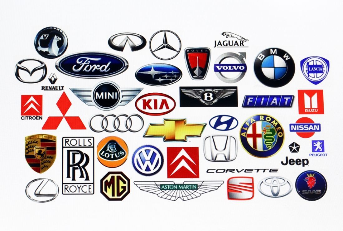
Have you noticed all the new logos recently? Logos are definitely evolving. They are getting less intricate, using very easy to read fonts, and any imagery or design is much simpler than earlier versions of the same logo.
Logo redesign isn’t new. Just about every organization revitalizes their logo every so often. But why – suddenly – are so many logos getting a make-over?
The answer is simple. Smaller screens.
Older logos full of visual information and hard to read fonts just don’t translate on cell phones’ smaller screens.
Another factor is that logos need to pop – getting easily recognized within seconds – no matter what else is going on around them. After all, logos don’t exist in a vacuum. They share space and compete with other information on pop up ads, newsfeeds, even on their own websites.
So what does that mean for your organization’s logo? If it’s been more than 5 years since you’ve taken a fresh look at your existing logo, it’s time.
Here’s how to begin a logo update:
• Get real about how your logo will most often be seen. That might mean on your store front and on your website, and mobile website, business cards, ads, possibly even on the items your company manufactures.
• Does your logo use a lot of space? Does it look similar to lots of other logos? Is it very horizontal or overly vertical? All of these issues will make it more difficult to use in a variety of applications.
• Pull out your phone and take a look at several different apps. Now look at your logo on this screen – perhaps from your website. It should be immediately identifiable.
• Does it tell people who you are and what you do in 3 seconds? Or does it need a tag line to make that clear?
• What’s in the background (behind the letters in your logo?) The more “stuff” cluttering your logo design, the less effective it is.
After you’ve taken a look at your company’s logo with fresh eyes, it’s time to look at logos that others use that you and your team like:
• Make a list of what you like and why.
• Notice things like colors, fonts, and size of letters.
• Note upper and lower case.
• Check out background colors.
• Register how warm or cool (and any other emotions) the logo suggests.
It’s always a good idea to look at your competitions’ logos. What do they do well, and what don’t they do as well? Be sure to notice dominant logo colors in your industry.
Once you have some pretty good ideas of what you like and don’t about your logo and others in your industry (as well as logos in general), talk to a marketer like us, one that consistently provides excellent professional logo design. Ask for samples of recent work. Have a conversation about timing and pricing.
After consultation and sometimes marketing research, a company generally receives several design “rounds” in which to fine-tune a new or redesigned logo. You have a hand in the design process.
Logo design isn’t rocket science, and there’s no single solution to your update. That said, it can be a lot of fun seeing your older logo evolve into a hipper, crisper, leaner looking version of itself. And – perhaps more interestingly — you’ll learn a lot about what is important to you and your company as a whole, during the process.


No Comments