
June 12, 2019
In
Social Media
Share Your Story On Social Media
Who doesn’t love a good story? Storytelling is one of the oldest ways of communicating meaning, vision and engaging people.

Who doesn’t love a good story? Storytelling is one of the oldest ways of communicating meaning, vision and engaging people.

Even the name is a little intimidating. I mean, “analytics,” really? Just because you never really got any math that was more involved than Algebra 101, doesn’t mean you can’t appreciate or won’t be able to use Google Analytics.
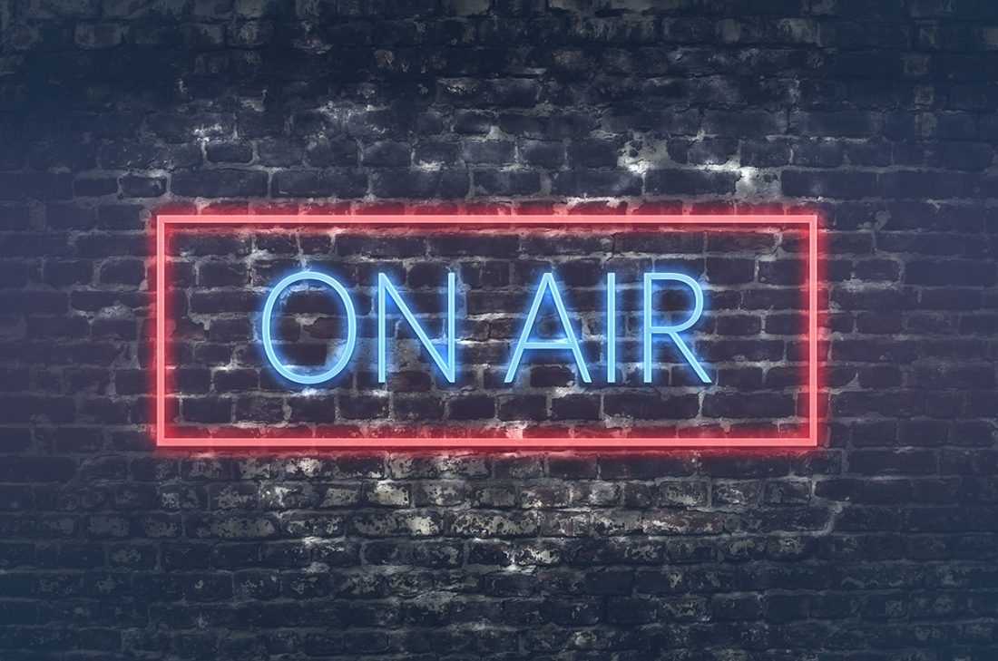
At FocalPoint, we talk a lot about digital media. But although we speak digital, it doesn’t mean we’ve lost the ability to swim in the more traditional modes of marketing. With brings us to radio advertising.

PR, short for public relations, is simply the way organizations present themselves. This can mean improving one’s online reputation through carefully planned marketing strategies. It can also mean sending the right messages to the right places and people in a way that builds and polishes your brand and your reputation.
PR and marketing agencies like FocalPoint work with clients to promote their image in whatever industry pertains to them. In many cases, public relations goes hand in hand with marketing to present a carefully prepared unified strategy.READ MORE